This Online Community Had the Same Design for a Decade; Learn How They Launched a Redesign That Members Embraced
![]() I’ve known Chris Bowyer for at least 14 years, which is as long as both of us have been managing online communities. Like many people, I found him thanks to forums. In 2000, he launched Movie Forums and he has run it ever since.
I’ve known Chris Bowyer for at least 14 years, which is as long as both of us have been managing online communities. Like many people, I found him thanks to forums. In 2000, he launched Movie Forums and he has run it ever since.
Movie Forums had the same design for a very long time and I knew this because I’d occasionally bump into it online. When I saw his announcement that he had launched a brand new design, it caught my eye because it is very challenging to redesign a forum that has had the same design for a very long time. I was impressed by the fact that the community was widely adopting and praising the design, which itself was quite nice. It’s not easy to achieve this and I knew Chris was responsible.
After the new design was launched, I reached out to Chris to ask if he’d write a guest post here, walking us through his process. How did he achieve such a positive result? What did he do to involve the community? How did he reduce the shock of changing a design that the community had been used to for so long? Chris was kind enough to share the details.
Recently, I decided to redesign my site, Movie Forums. This isn’t exactly newsworthy, except that the site in question is nearly 14 years old and it had been using the same design for 10. I’ve had intelligent conversations with people younger than my site’s design.
The Problem
The site had become very cluttered. If you’ve ever seen an episode of Hoarders, it was a little like that. And for the same reason: no rush of activity, just the gradual accumulation of “stuff.” In theory, an old forum need not necessarily be a cluttered one, but in practice it often is. It’s not hard to see how this happens: a user suggests a feature, and you dive into the code or go looking for a plugin. And if you do, you poke around a little more to see what else you can improve while you’re there. An hour later you might have half a dozen new features. But you still have the same design, a design which was created without those features in mind. You have more things to fit into an identical space that wasn’t even created with them in mind.
What does it look like when you do this for a decade? Something like this:
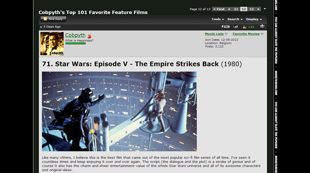
I’ve seen worse, but you could write several paragraphs about the visual confusion and misallocation of space here. I decided something had to be done.
Pros and Cons
As soon as I made the decision to redesign the site, I knew there were forces working both for and against me. The extreme age of the design, and all the things I’d learned in the decade since, meant that anything I could come up with would likely be a big improvement. I also knew that a large portion of the community would be receptive to something fresh. It was a low bar to clear.
On the other hand, while some users had probably come to find the layout stale, others had become that much more accustomed to it. The age of both the forum and the design made for a relatively unprecedented situation, so it was difficult to know which sentiment would win out.
My design process was unusually protracted, but a number of principles served me well throughout, and I learned others that would have saved me a lot of time if I’d known them beforehand.
Change What You Have To
If you can keep something where it is without sacrificing aesthetics, do so. And if you have to move it, think long and hard about where people might expect to find it instead. You’re not starting from scratch, so you’re not just picking the best design concepts: you should be weighing each of them against the downsides of confusion and disruption. If you can make something easy to to find for your existing users that looks 80% as good as your ideal design, you should.
In our case, the site was so old and jumbled that dramatic changes were inevitable, but whenever possible we tried to echo the placement of options on the old site.
Join the Resistance
People hate change, and a certain segment of any user base is going to be hostile to anything different (just look at how people react to every change Facebook makes). And your most loyal users may be your most fervent critics, because they’re the ones who’ve grown most accustomed to the way things are.
It’s tempting to brush this off as knee-jerk resistance, but you shouldn’t; there’s an insight here that you should incorporate into your design. Most people only care a little bit about how a forum looks: they just want to know how it works. They like knowing where everything is, and when you move things around, they have to relearn things. Start with a healthy appreciation for these people, because there are probably more of them than you think.
Pick a Single Goal to Help You Make Decisions
There’s a famous (paraphrased) George Patton quote that “a good plan today is better than a perfect plan tomorrow.” He probably wasn’t talking about web design, but it’s still applicable. Building (or rebuilding) a site involves thousands of tiny decisions, almost all of which involve trade offs. Given enough time, you could probably parse each trade off and almost always find the better choice. But time is finite, and for a busy site owner it’s downright scarce. Being productive means finding smart shortcuts to minimize the amount of time you spend choosing and maximize the amount of time you spending making them reality.
How do you do this? By deciding, at the start of the process, what you most want your users to take away from their time on your site. Should the site feel busy and active, or clean and open? Modern or old fashioned? Should they feel it’s simple and easy to use, or powerful with lots of options? Make this decision first, and every time you’re torn on a choice, ask yourself which choice is more consistent with that goal. Do this long enough, and by the end of the process most of the choices make themselves. It’s like a puzzle: get enough pieces in place, and they’ll show you the exact shape of the ones you need to finish the picture.
As our redesign went on, I noticed more and more that decisions I’d made independently (and months earlier) were complimenting one another as if they’d all been designed simultaneously alongside the others. The more you stick to an overarching design choice, the more you’ll get to enjoy this kind of serendipity.
One of the most satisfying moments of the entire process came when one user said that the new look “harks back to classic cinema yet remains modern.” My wife saw the post and said “that’s almost verbatim what you told me you wanted people to say!” She was right. And there’s no way I could have gotten a response so close to what I’d hoped for without returning to a consistent goal to keep me on track.
Design for the Site, Not for the Launch
Remember when you were a kid, and people would buy your shoes a half-size too big so you could “grow into them”? Do the same thing with your design. You’re probably in this situation because you like adding things, so it’s a safe assumption that you’re going to want to do so in the future. Design based on that assumption.
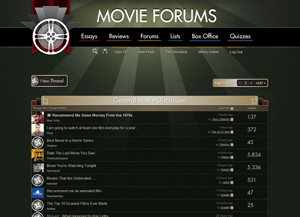
Take a look at our site’s old navigation:
I still think this is lovely, and it was downright stunning 10 years ago, but there’s a problem: it’s all images. When the time came to add a new section, I had to hire someone to create new buttons in the same style.
A lot of site owners make the same mistake of designing for the launch, and not for the day-to-day, month-to-month, or even year-to-year process of running the site afterwards. They’ll trot out eye-popping, meticulously crafted post layouts that leave just enough room for the existing options and information, but which can’t be added to or changed without throwing the whole thing off. This makes a big splash, but seems superfluous after a week or two, never mind a year. Good, clean design might not make for a grander reveal, but the reveal is just a few days. The people who’re going to be there months later are the ones you’re designing for.
Let Information Trickle Out
There’s not a media entity in the world that doesn’t “tease” its content in some way, be it cliffhangers at the end of a chapter, huge revelations before TV commercials, or references to upcoming guests at the end of radio segments. Website owners can do the same thing. Once development is under way, pick things to tease, like tiny screenshots of half-visible elements, or fuzzy, Dutch angle shots of the site on a phone or a monitor. Just enough to give them a rough impression. Be shameless about it! It’s fun for the users and for you. And their excitement can be energizing, which helps when the work gets tough.
In my case, I went a step further than cropped screenshots. Because I was customizing a new forum style with its own set of templates, I could actually use it (while everyone else retained the old style) for the last month of work. This meant I could flip a switch and and allow any other user to start using it, too. So sometimes, I did. Someone would say something about how they couldn’t wait to see the design (usually in the thread where I was posting teaser images), and I’d flick the switch for just a minute or two. They loved it! And what’s more, when it was over they’d go back into the thread and tell everyone what happened, and rave about what they’d seen. And it encouraged others to hang around more, because they knew that they might be the next person to get a random sneak peak.
On top of the excitement it generates, this is a great way to let people know what’s coming, and get used to the idea. You want surprise, not shock. The people most resistant to change will respond much better to your changes if you give them a heads-up.
Beta Test the Design – and Use Real People
You know more about your site than anyone else – but you don’t really know how people use it. You look at it differently than they do, because your relationship with it is different. Before you go live, recruit some users to test the changes. Do this late enough that most of what they test is likely to be in the final product, but early enough that you can make any necessary changes.
Obviously, you want to test for bugs, first and foremost. No matter how thorough you are, your users will find things you can’t. But they don’t just have to discover new things to help you: they can simply show you things from their perspective. There are many things about your site that you’re already aware of and find unimportant that your users think are crucial. And you won’t know what they are unless you ask.
Make sure to use a nice cross-section of people, too: the tech-savvy and the casual users each have their own types of insights. You can tweak this depending on what type of site you have and what you expect your biggest challenges are going to be, but don’t just pick the most active, attentive users. Pick a few people who aren’t on your site all the time, too, because they use it differently than the most dedicated users.
The Result
I knew from the peeks I’d given people, and the handful of users who tested it, that we might have something special on our hands. A good response was inevitable given the age of the old design and the work that had gone into the new one. But the early response went far beyond the polite, obligatory praise people tend to give.
Here’s the same post from above, with the new layout:
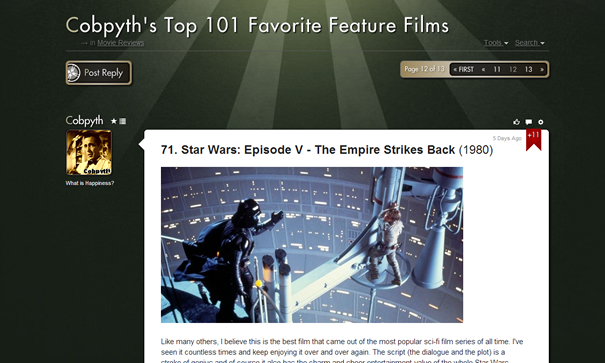
When we went live on February 27, the response was overwhelming, and our testing paid off, too, because most of the bugs we ran into were either relatively minor or fixed quickly. Even the people who were nostalgic for the old layout saw the benefits, and within days people were talking about how quickly they’d gotten used to the changes.
Most redesigns won’t need to be as dramatic as ours, and these principles won’t do the hard work for you. But if you run a community, you already know it isn’t like running other sites – it’s a constant conversation with users, and the quality of your technical work is only one side of it. Hopefully, my experiences will help you with the other side, so that the work you do has the best possible chance of succeeding.
Chris Bowyer is a television producer and web developer from Pittsburgh, Pennsylvania. He can be found on Twitter @chrisabowyer. You can signup to receive updates on one of his next projects at MovieStax.